February 20, 2018
The convergence – Responsive design
The convergence – Responsive design
Sometime in 2013, probably 1 year before Zoom launched its Screen sharing feature, in a different world(read: company), I was working on a smart-projector initiative to share power points and excel sheets among remote participants within the company’s intranet. (It was an internal project with constrained scope and used a server client upload-download-display model) This feature was meant to be accessed through the smart-projector front-end website that I had helped build. Before the D-Day (demonstration day), my manager wanted to test the progress on his way back home from the office cab. Guess what did he do conveniently? He whipped out his VPN enabled phone, launched the website and to his horror saw the options, buttons, drop-downs stacked up on top of each other like the Lego Building blocks.

Back then I was not a UI expert nor am I today. Nor was I aware of existing frameworks that could help me make my UI adapt to the device screen size with which it was accessed. I had no time to learn and ramp up. I worked around it to save my bum and cheated some devices. But you do not have to do so today.
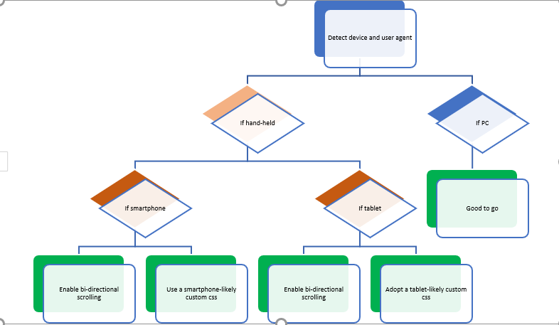
If you are a web developer, or an UI guy or a front-end QA guy, learn what a responsive web-design is. In simple words, it is a design that is automatically re-sizeable and optimized for viewing on different devices and pretty much what you see below:

Do NOT do what I did 😊:
Recent Comments