You may have been hearing about the 2020 Decennial Census in the news over the past year. Aside from the census’ mandated uses (determining taxes and representation in Congress), anonymized census data is often used in research. Historically, it has been accessed via large and complex data tables. While the data and information is really rich, this research can feel tedious and time consuming.
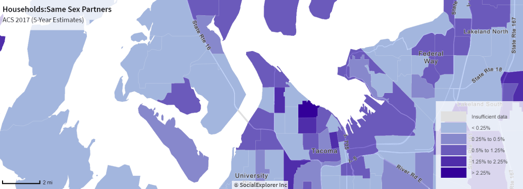
Enter: Social Explorer. This is a tool that the UW Libraries subscribe to that allows you to instantly map and visualize data from the census or American Community Survey. Curious about what neighborhoods or counties have the highest concentration of poverty? Or, want to visualize where immigrant communities have settled across generations? These are great research questions that can be visualized with census data. Maybe you are deciding where to move–I did a quick search to see which areas of Tacoma had same-sex households to help determine if a neighborhood is queer-friendly.
Whether for your research or just general curiosity, Social Explorer is a great tool for beginning to use and visualize government data.
 Households: Same Sex Partners [Map]. In SocialExplorer.com. ACS 2017 (5-Year Estimates) Retrieved October 28, 2019, from https://www.socialexplorer.com